
Mug Series
Creative Direction, Packaging Design, Project Management
Photography by Texas A&M Foundation Visual Media Team
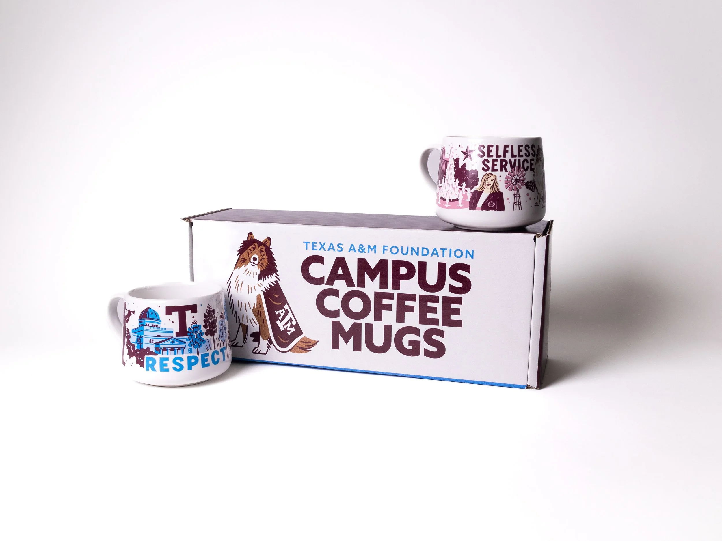
Each year, the Texas A&M Foundation creates a special end-of-year gift. Lightly inspired by doodle mug ware taking every Starbucks and college campus by storm, we decided to take on the challenge of creating an even better and Aggie-rific set.
Project Roles
While I played lead creative for this project — developing the creative brief, managing the search and hiring of an extern illustrator, and designing the packaging — I was supported by our other in-house designer and one of our creative writers to bounce ideas off, manage the print vendor timelines, and help craft clever copy for our boxes.
Ideation
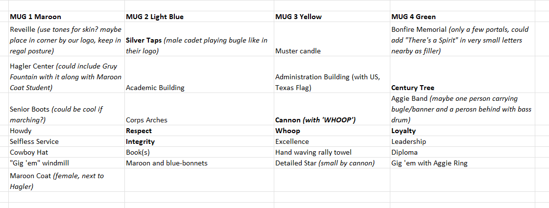
As Aggies, we were guided by Texas A&M’s core values to help make this mug series special. We wanted to include each of the six values written out on the different mugs but also needed to creatively fill the space with other iconic Aggie imagery. Since the Foundation supports every unit across campus, we had to be careful not to show a bias toward one unit over another but decided we should include a few specific Corps of Cadets icons given their involvement in many campus activities and the university’s military background. Lastly, we knew we wanted a touch of maroon on each mug but also wanted to find a way to give each mug a unique feeling and color palette.
Creative Brief
In addition to outlining the basic design specifications, such as color palette, logo usage, timeline, and background information, I compiled a curated list and matching reference images in the following categories for guidance on our Aggie imagery: Aggie traditions; campus buildings and landmarks; Aggie values and sayings; Corps of Cadet imagery; and miscellaneous iconography tied to Texas and higher education in general.
While developing briefs, I also deep dive into our prospective illustrators and their various works. I like to include their direct work in the style guidance section to help both sides of the vendor agreement better envision the end goal, set realistic expectations, and feel confident about the illustrator’s ability to meet the said expectations.
Refinement
With so many options of different Aggie elements to include, our illustrator, Brave the Woods, had an overflowing sandbox to dig into. After receiving his initial rough sketches, it was clear I needed to provide additional guidance on which items made the most sense when grouped together to an Aggie audience. But having his rough sketches helped these thoughts click into place with a visual reference and outlined some grey areas I needed to color in for him (like the usage of natural skin tones outside of our brand color palette). From here, I was able to clearly define which items should go on each mug and how these groupings could guide our color palette selection for each mug.
Final Illustrations
After a few more sketch, placement and style revisions, we arrived at our final compositions about six weeks post kick-off. Here are the wraps of the four mugs in the series:
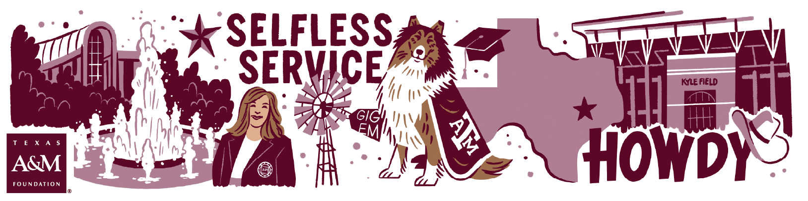
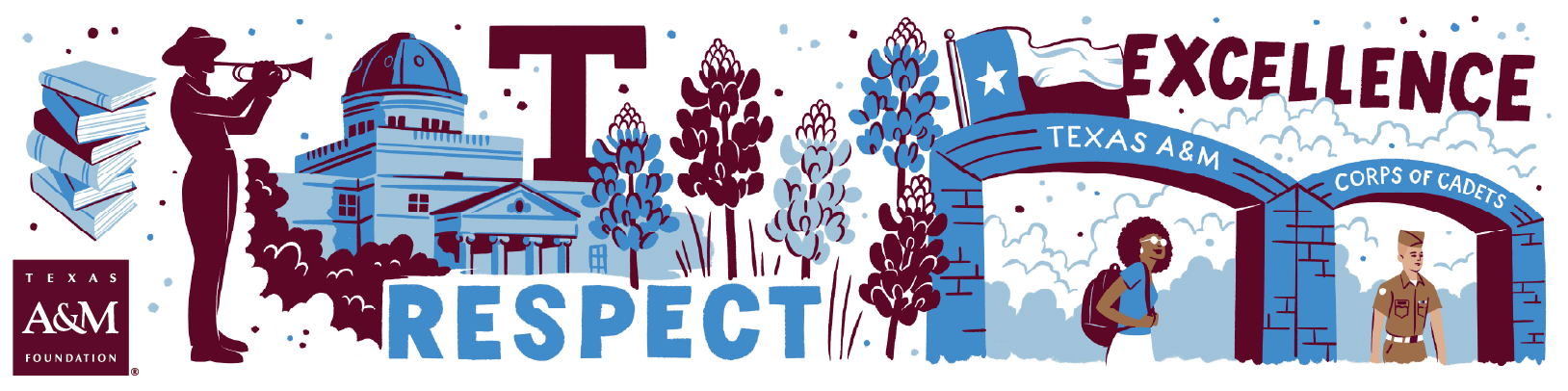
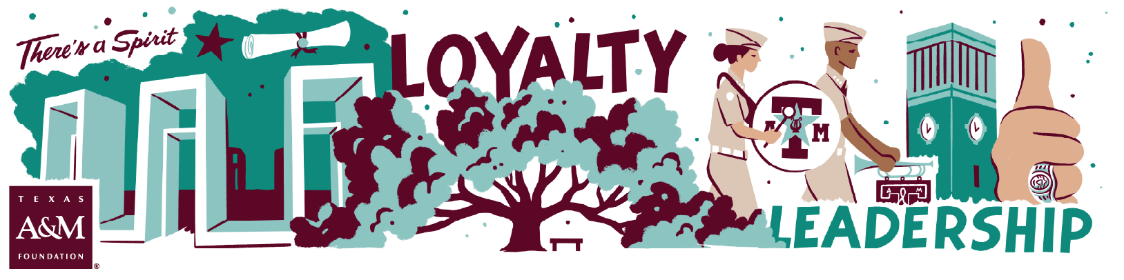
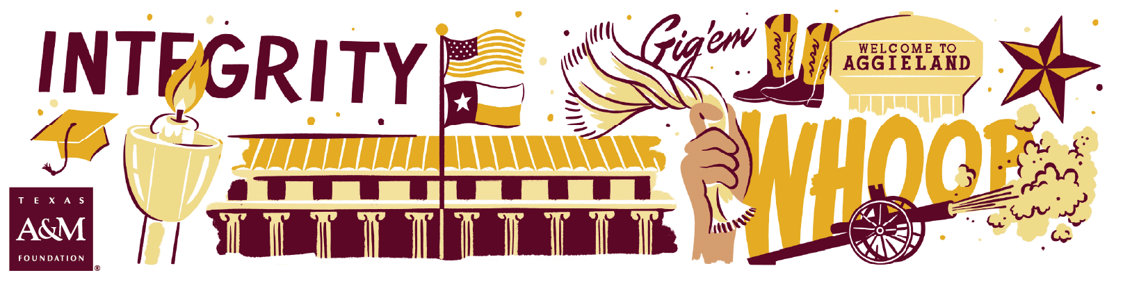
Illustrations by Brave the Woods
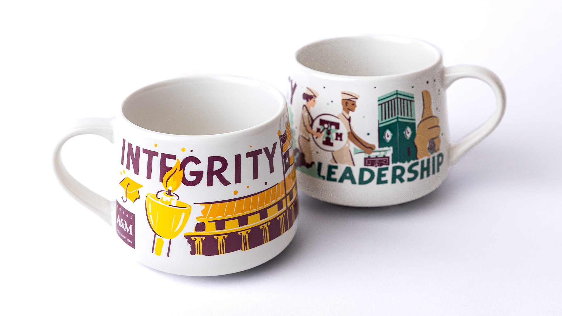
Mugs printed by Created Co.
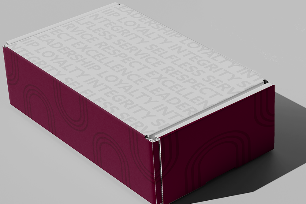
Packaging
With mug design finalized, creating its packaging was next on the list! We ultimately decided to stretch the project over two-years and gift two mugs at a time. Our local print vendor was a huge help in creating custom box and insert die lines for us to utilize. We also requested the separated iconography from the illustrator so we could utilize some of the assets on the box (and potential other swag items).
Outside of the two illustrations I pulled, I relied on my favorite brand elements to bring the box design together:
background outline type reading “Brighter Future” (part of our mission statement) on the inside top lid
wrapped maroon arch pattern along the sides and back
restyling our repeated tagline type pattern to read the six core values instead on the bottom
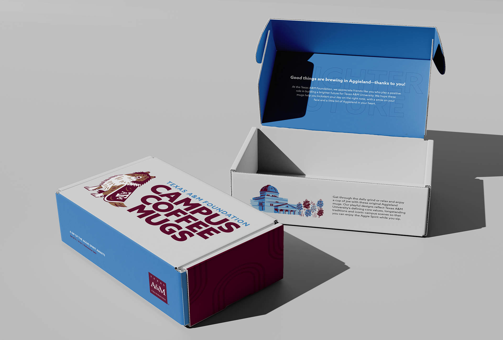
*Mock-ups not to scale