
Heritage Magazine
Creative Direction
Illustrations by Brave the Woods
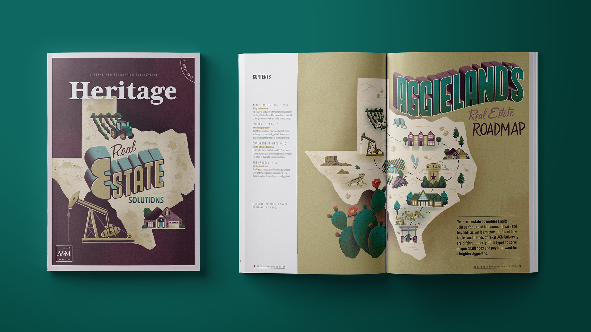
For the Summer 2025 issue of Heritage Magazine, I had the great opportunity of developing the creative brief and hiring an illustrator for the cover page and corresponding interior spread. After discussions with the magazine’s editor, I wrote our creative brief detailing background on the magazine and the issue’s real estate themed content; the magazine’s brand colors; file, dimension and timeline specifics; several conceptual and stylistic reference images for this almost vintage postcard style; and a simple wireframe.
For this summer issue of Heritage, we wanted to lean into the idea of summer travel and geographical/regional elements that relate to the idea of real estate gifts. The whole issue was set up to walk through the different types of real estate gift methods the Texas A&M Foundation accepts. We wanted to feature a variety of asset types including different house styles, ranch/farmland, and mineral rights, without making it the whole focus of the design. Since the average audience age of the magazine is 65 (with a circulation of ~35,000), we also thought a vintage postcard style would be well accepted.
I had previously worked with the illustrator we ended up contracting for this project, so I knew he had lived in Texas for a time and would be familiar with the general imagery of the state and our brand. But, during our kick-off call, I realized how helpful it would be to provide a little more detail on the composition of the iconography we proposed for the work. Just as it wouldn’t make sense to draw a skyscraper in the middle of the rural countryside, to Texans, it wouldn’t make sense to draw a vineyard in North Texas — and that was not something I wanted our skilled illustrator who now lived in Washington State to have to worry about.
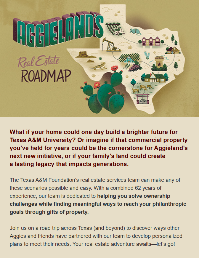
The afternoon after our call, I quickly conducted my research to ensure my guidance was based on the facts of economic output, geography, and wildlife habitat locations in Texas, and not just my memories of road trips across the state to visit family. I then put together this map to guide the illustrator’s iconography placement. Everyone on the team rejoiced in this detail as it set our illustrator up for success and greatly minimized rearranging edits — his initial pencil sketch reflects the final product almost perfectly!
MAP LEGEND
Teal text represents our real estate symbols that tie into the issue’s content.
For filler, I denoted the more geographically-restricted Texas/western symbols in gold that could be used. Additional, non-geographically bound symbols were also listed in the brief.
Fun fact: in making this map, I learned that we have armadillos in all regions of Texas except for one, so I marked it as a “no armadillo zone.”
The maroon star marks College Station, home of Texas A&M University.
Typically, the stories in Heritage magazine are dripped out over a couple editions of the Foundation’s bi-weekly newsletter, but in addition to that, we sent a one-off email with all the content to a targeted real estate gift focused audience where I was able to reuse the illustration in the header.
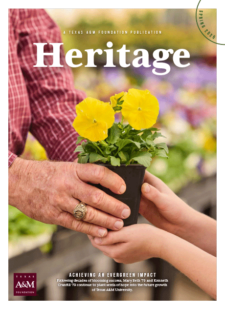
This was not my first time supporting the magazine, though. For the Spring 2025 issue of Heritage Magazine, I was able to attend the photoshoot for our cover story and direct the final cover image in real time.
Photography by Jason Kindig
This issue’s cover story features a donor couple who have established a planned gift to create endowments supporting horticulture students and the Aggie ACHIEVE program, which gives young adults with intellectual and developmental disabilities an immersive college education. The donors used to own a plant nursery and have history of supporting children with special needs, and thanks to their extreme generosity, both of these passions will receive funding in perpetuity.
Before the shoot, I had a rough idea of the donor’s hand passing off one of the nursery plants to his grandchildren for the cover image. We were shooting at a real nursery commercial site, and our skilled photographer, Jason Kindig, was able to help stage the image just perfectly despite the chaos of the whole donor’s family and the store’s customers watching.
I am so pleased with how the cover turned out. It subtly conveys a sense of an older generation trying to leave the world a better, more beautiful place than they found it and pass down some support to the next generation.